
#0B1613Iron Power design system
Built for
the next level.
A high-contrast, performance-led visual language built from discipline, energy and precision.
01
Foundation
Colour & surface
#1E4937#ED6703#F3F2ED#242927#DDE2DC
Surface rule
Use warm white for editorial clarity, deep ink for impact, forest for depth and Power Orange only for decisive actions or controlled emphasis.
02
Typography
Voice with momentum
ONE DAY,
OR DAY ONE?
H2 / 72
Built for your next level
H3 / 32
Performance without compromise
Base / 16 · --text-base
Premium nutrition engineered for performance, recovery and real results.
Label / 14.7 · --text-label · the floorATHLETE FAVOURITES · 2026
03
Actions
Clear next steps
Buttons
Links & badges
04
Components
Cards with purpose
Performance
Nutrition designed to support strength, endurance and focus.
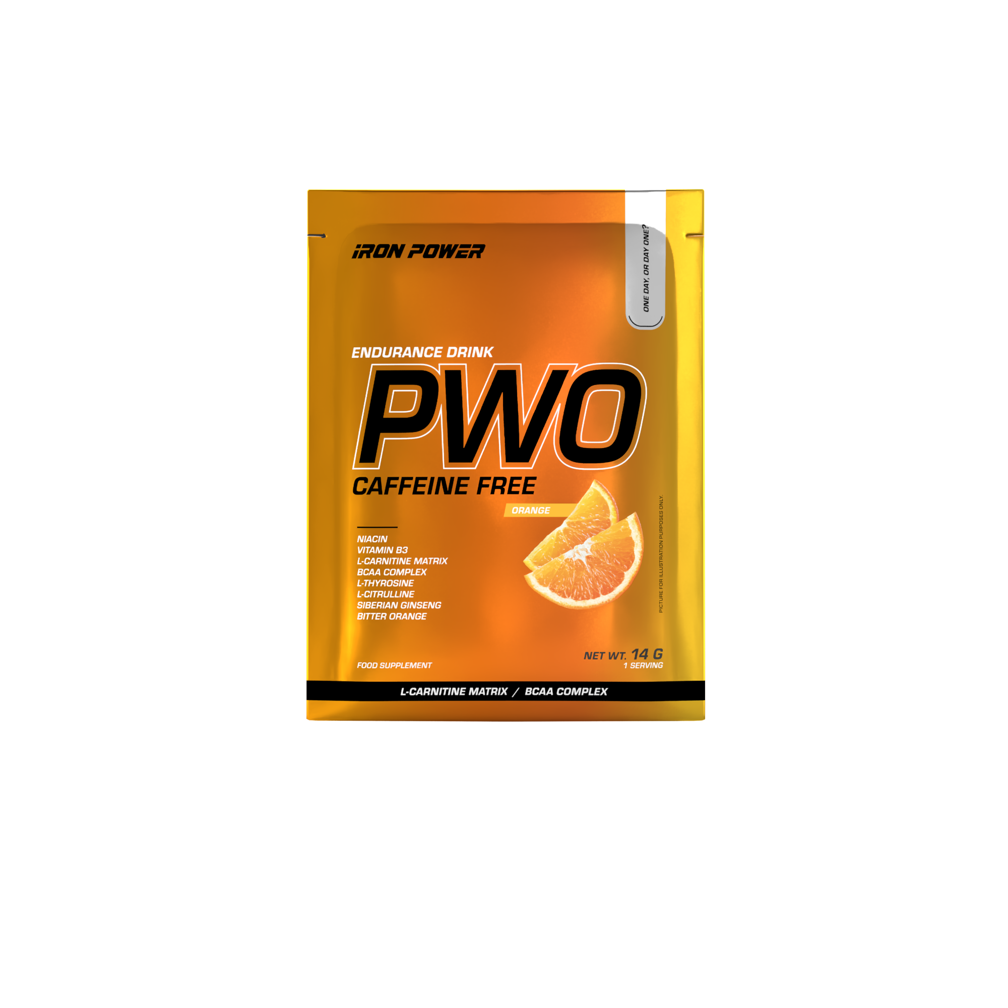
Energy & Performance · 14 g
PWO Caffeine Free
Orange · Single serving $35.00Strength & recovery
Break limits. Recover harder.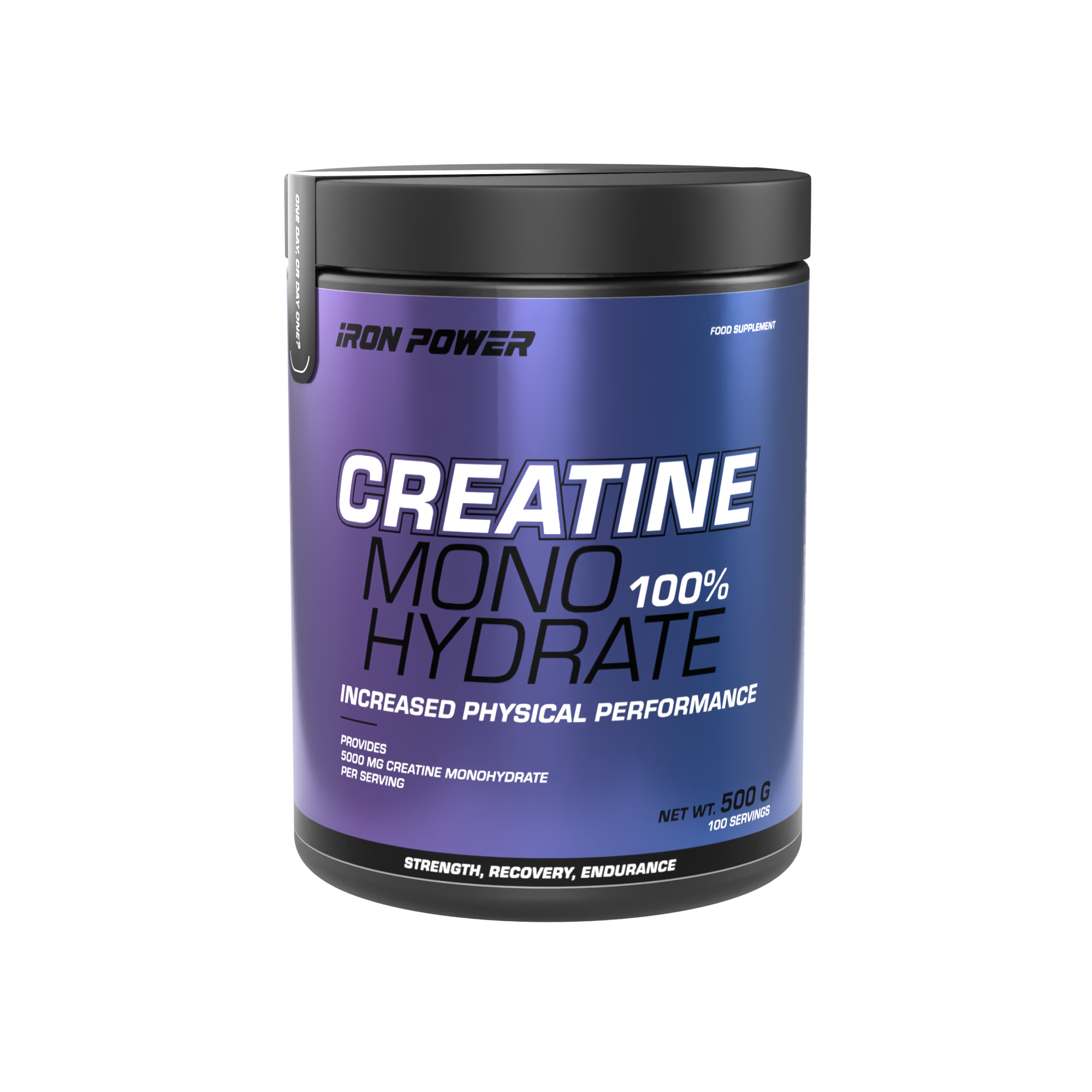
05
Catalogue
Browse and narrow
Category tabs — real links, so Back, open-in-new-tab and copy-link all work
Icon controls — 44px targets; the badge counts active filters
Filter chips — a visually hidden checkbox drives each one, so grouping, state and keyboard behaviour are native
Active filter tokens — the whole token is the hit area, not just the ×
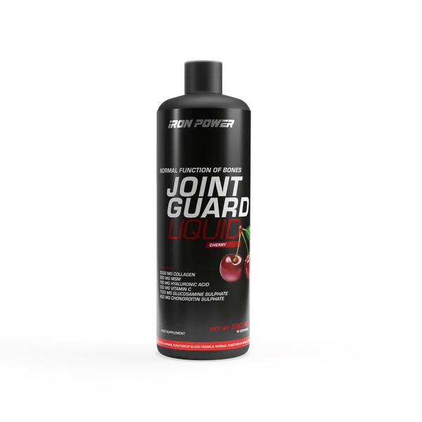
Listing card — the .product-card shell as a link, with the on-request price treatment
06
Forms
Confident, accessible input
Accessibility: every interactive element keeps a visible orange focus ring, a minimum 44 px target and a text label.